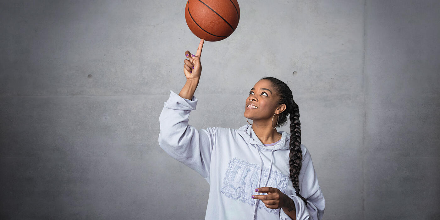
THE PSYCHOLOGY OF VISUAL MERCHANDISING
Yasmina Junek Senior Partnership Manager Select
When you get right down to it, Visual Merchandising is a commercial art form of persuasion. When correctly applied, the principals of psychology can allow the VM to help the customer recognize a need inside them to buy our products. Knowing how the human mind works helps to persuade but also to fulfill those needs — in the end not just selling products but emotional satisfaction as well.
In school, I always saw myself becoming a psychologist, but when I took some time to work before heading to university, my life plan changed completely. Never letting go of my passion for the subject, I’ve continued reading up on Psychology and applying it to my work as a visual merchandiser. Here is what has worked for me so far.
PERCEPTION IMPACTS BEHAVIOR
As a visual merchandising manager, I visit PUMA stores regularly. I try to visit as if I am the customer. Each time I’m reminded that the shop needs to be relatable, inspiring and making people feel comfortable at the same time.
The store windows are the first point-of-contact with the customer. Our first chance to peak their interest or win their hearts. Often our windows display large photos of our assets and ambassadors along with the merchandise. The idea behind that is simple: When a person sees Cara Delevigne in the window, his or her brain subconsciously connects to her as a model, actress and activist. They may admire her, find her interesting or feel some comfort when they see her — and a connection is made. Maybe the potential customer notices the products in the window, maybe not, but the window is the hook, hopefully convincing the person to walk into the store.
ENTER THE “LANDING ZONE”
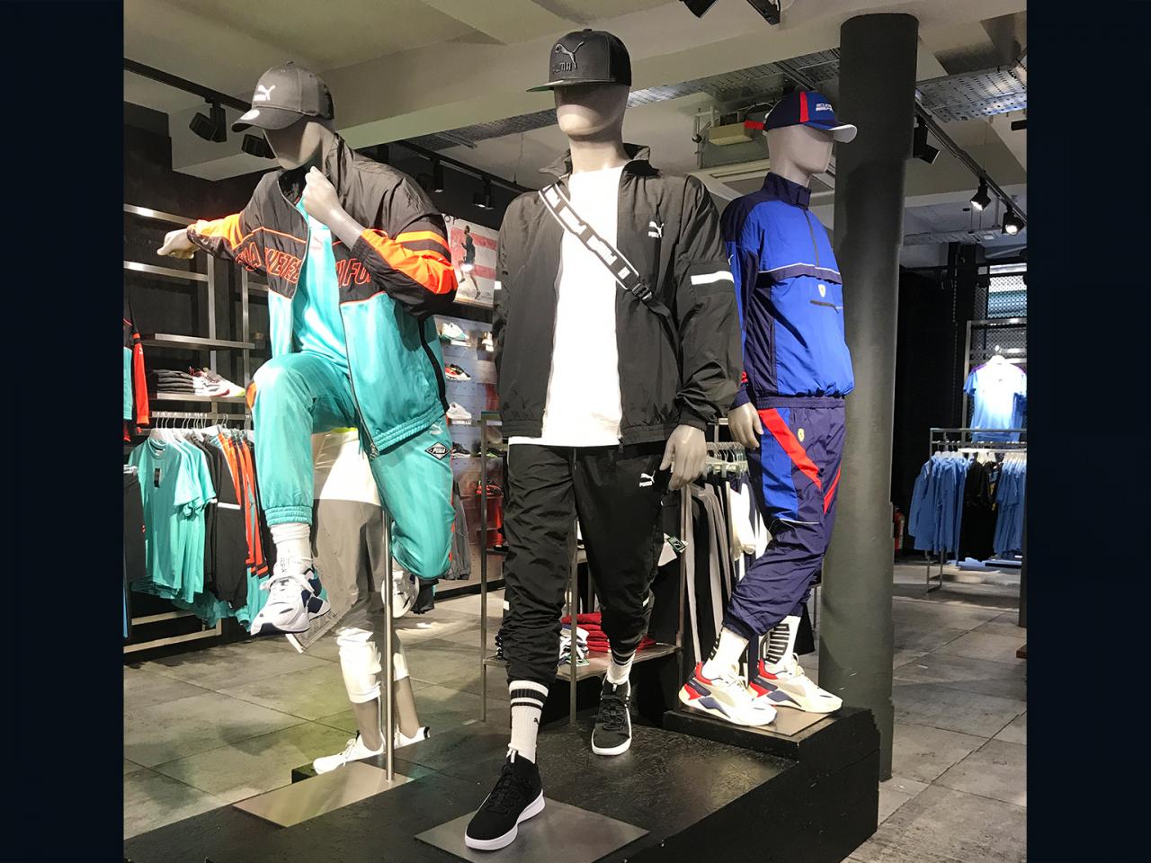
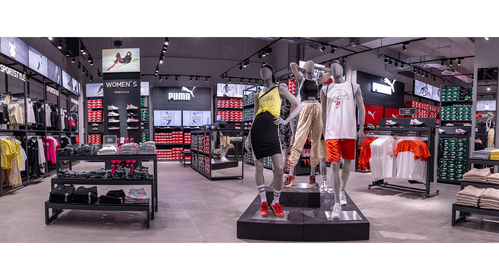
Never forget that as the VM, everything visible to the customer is your domain. An inviting and open entryway is your “Landing Zone”. You’ll want to take advantage of the fact that the typical customer spends a few minutes orienting themselves in this space. Here you can connect your mannequins and products with what was featured in the window(s). The entryway is also a chance to play on the impulsiveness of the customer. When products are placed right next to the mannequin wearing them, the customer can pick them up immediately. They see it, they like how it looks, they pick it up. It’s fast and exciting.
CREATE LAYERS
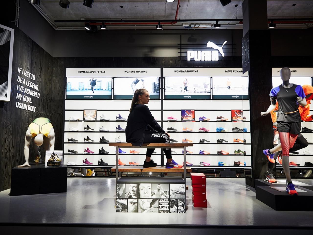
Now the customer has seen the product in the window and in the landing zone. In direct view of the entryway but further into the store, those same products, perhaps in multiple colors, could be displayed for a third time. This doubling and tripling effect builds the comfort of the customer with these products and increases the chance that the customer will at least try them on.
ALLOW YOUR LAYOUT TO LEAD
Next up are clear walkways and accessible seating areas. Customers should get to feel like they are browsing at their own pace and creating their own shopping path, but clear walkways help to guide them — hopefully to the products that you are featuring. Easy seating areas are a necessity in order to get customers to try shoes on. In addition these areas to give customers a chance to rest — giving their shopping partners opportunity to stay longer in the store.
BE PURPOSEFUL WITH COLOR
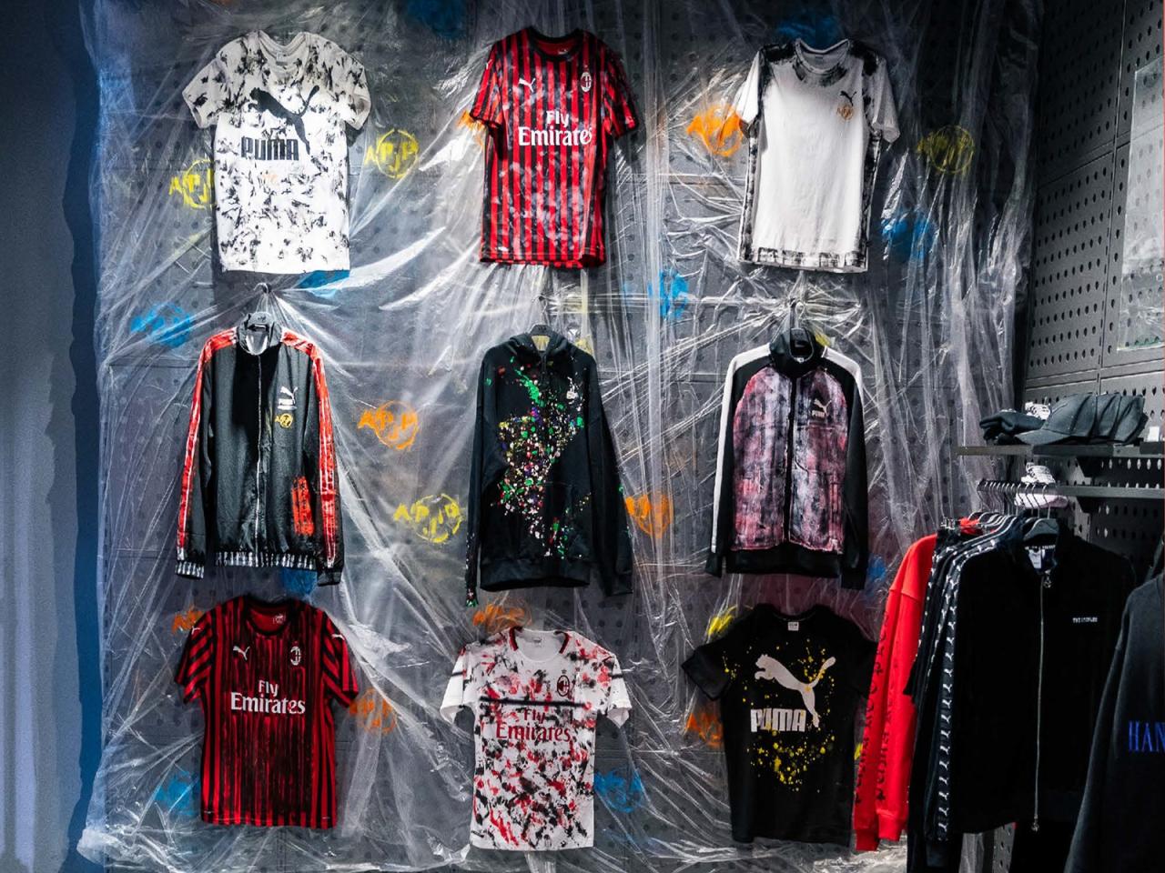
As VM, you decide how the colors and products are presented. In any given season there might be 10 new colors featured. It is paramount that colors are arranged in an energetic and complimentary way so that the customers do not feel overwhelmed. It’s helpful to divide colors combinations into different areas that match the flow of the space. This draws the customer from one display to the next allowing them to see all that the store offers. Customers will naturally be attracted to the area of color that appeals to them.
LIGHT UP YOUR HIGHLIGHTS
Lighting is one of your most important tools. It gives life to the mannequins and helps to highlight the product. With the use of the right light, you can emphasize dark colors or special materials, raising the interest of the customer and the likelihood of purchase.
GIVE IT A GOOD VIBE
The smell of the shop and the music truly impact the customer experience. The music should compliment the brand. At PUMA this means genres like hip hop/RnB and pop. But which ever brand you work for, these subtle details should create an atmosphere that makes the customers feel confident and energized. As the Virtual Merchandiser, these details are in your hands. Understanding the psychology of visual merchandising is one of the things that keeps my work fascinating and makes the numbers soar.